This is an old revision of the document!
This page is not yet adapted for Transport Fever 3. The content may be outdated.
User Interface
The existing user interface of Transport Fever 2 can be extended as well as additional interface components can be added via modding.
Style Sheets
The visual style of user interface elements is controlled by style sheets in res/config/style_sheet/. These files are combined to an internal stylesheet by the game. To tweak some values or add new style definitions, add a custom stylesheet in your mod with a unique name.
require "tableutil"
local ssu = require "stylesheetutil"

function data()
  local result = { }

  local a = ssu.makeAdder(result)          -- helper function

  a(
    "ConstructionMenuTab::ButtonsLayout",  -- Selector
    {
      margin = { 0, 0, 30 + 35, 0 },       -- style
      ...
    }
  )

  return result
end
To generate the correct stylesheet information, usually a helper function in the stylesheetutil.lua is used. It receives two parameters: A selector and the actual styling.
Selectors
The selectors are similar to CSS selectors but have some smaller differences. The whole selector is a string and several comma seperated alternatives can be used with the same styleset.
Basically there are three ways to select an element:
Nameselects by the element name.!a-class-nameselects by a class name.#anIDOfAnElementselects by the id.
To select by a hierarchy, you can seperate the levels with a blank character: Parent !child-class. To specifically address individual referenced elements, :: can be used: WarningsButton::Icon.
There are several pseudoclasses that can be used with selectors:
:enabledis used for elements that can be used.:disabledis used for elements that are locked.:hoveris used on mouseover.:activeis used when in active state, e.g. selected image buttons.
To find out the name or class of an ui element, you can use the ingame tools to pick elements. Then the name of the element that the cursor points on is visible in the console.
Styles
There are different kinds of styles that can be set for an element.
Size, Spacing and Padding
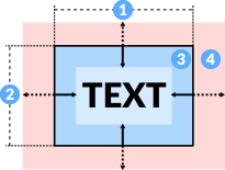
To define dimensions of an ui element, there are several properties:
sizeis the default size as a two integer vector. The first value is the horizontal size 1. The second value is the vertical size 2.minSizeis the minium size that a component may get. This is the lower limit for resizable windows. It is a two integer vector too.maxSizeis the same for the upper limit of resizable windows.
From the frame that is defined by the size properties, there are offsets to the inside and to the outside:
paddingis the inner blank space that is hold free of content 3. It is a vector with 4 integers for the top, right, bottom and left padding.marginis the outer blank space that is hold free of other elements 4. It is a vector analogue topadding.
The gravity is a vector with 2 float values that is used for the positioning of the element. It is a vector of two float numbers, one for the horizontal and one for the vertical positioning. Both can be set to 0.0 for left/top position, 0.5 for center positioning and 1.0 for right/bottom positioning. If set to -1, the element will grow in that dimension to fill up space.
For layout components, there are additional properties that control the spacing between the contained elements.
innerSpacingis a vector with 2 integer values. These control the additional padding between the elements that are contained for horizontal and vertical direction.outerSpacingis another vector with 2 integer values. These control the additional padding between the elements and the outer layout for horizontal and vertical direction.
The scaling property contains a single float value that is used as a scaling factor on the whole element. Further scaling is applied through the global scale factor in the user settings.
Font
Elements with texts have several other properties:
coloris the color of the text. It is a vector of 4 float numbers between 0 and 1. The values are for red, green, blue and alpha.fontFamilyis a reference to a.ttffont file relative to theres/fonts/. Currently, theLatofamily is used as default for all texts except the console whereNotois used.fontSizeis the height of text in pixels that is used for the text.textTransformis an operation that is applied to the text input that should be displayed. It may be:"NONE"for the text as it is (default)."CAPITALIZE"to ensure that the leading letter of each word is a capital letter."UPPERCASE"converts all characters to uppercase."LOWERCASE"converts all characters to lowercase.
textAlignmentis a vector of two float numbers, one for the horizontal and one for the vertical alignment of the text content. Both can be set to0.0for left/top alignment,0.5for center alignment and1.0for right/bottom alignment.
Background

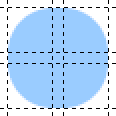
The background of ui elements has several layers:
In the back, just above the shadow is a color only layer that is controlled by the backgroundColor 2.
Above the color backgrond, is the layer that is controlled by backgroundImage1 and backgroundColor1 3. backgroundImage1 has three properties:
fileNameis a reference to an image relative tores/textures/. It may either be a colored image or it is a greyscale image. In the later case, black is masked as transparent while the rest is colored with the color defined inbackgroundColor1.horizontalis a vector with 4 integer values. They correspond to:- left position of the left border column.
- left position of the repeatable middle column.
- left position of the right border column.
- right position of the right border column.
verticalis another vector with 4 integer values. They correspond to:- top position of the upper border row.
- top position of the repeatable middle row.
- top position of the bottom border row.
- bottom position of the bottom border row.
If horizontal or vertical are set, the referenced image repeats the area between the second and third value until the image is large enough to fill the element. Otherwise it is used as a static image.
There is another background layer 4 that is controlled by backgroundImage2 and backgroundColor2 like the other background image layer.
Border and Shadow
For the border 5, there is a set of three properties available:
borderImageis a struct with properties analogue tobackgroundImage1above.borderColoris is a vector of 4 float numbers between 0 and 1. The values are for red, green, blue and alpha.borderWidthis a vector with 4 integer values. They correspond to:- top border width.
- right border width.
- bottom border width.
- left border width.
The properties for shadows 1 are defined identical to borders. Their names are shadowNinePatch, shadowColor and shadowWidth.
To blur the content behind the window, it is possible to set a blurRadius to some positive float value.
Transitions and Animations
transitionPropertyis a list of property names that should have a smooth transition to new values, e.g. due to a new pseudo class getting active. If unset andtransitionDurationis set, all properties are used.transitionDurationis a vector of float value that define the length of the transitions. If only one value is set, it is applied to all transitions.transitionTimingFunctionis used to define how the value gradually changes:LINEARhas a linear playback.EASEhas an S like speed curve.EASEINstarts slow and gets faster.EASEOUTstarts fast and then slows down to the end.
Animations are keyframed changes of color properties. They require their own animation keyframe definition in result.animations:
result.animations.attention = {
  [.0] = {
    color = { 1.0, 1.0, 1.0, 1.0 },
    backgroundColor1 = { 1.0, .0, .0, .0 },
    backgroundColor2 = { 1.0, 1.0, 1.0, 1.0 },
  },
  [.5] = {
    color = { 1.0, .0, .0, 1.0 },
    backgroundColor1 = { 1.0, .0, .0, .5 },
    backgroundColor2 = { 1.0, .0, .0, 1.0 },
  },
  [1.0] = {
    color = { 1.0, 1.0, 1.0, 1.0 },
    backgroundColor1 = { 1.0, .0, .0, .25 },
    backgroundColor2 = { 1.0, .5, .5, 1.0 },
  }
}
This animation then is referenced by its key in the animationName property. The total duration of one animation playback is specified as a float value in animationDuration. It is possible to limit the number of loops with the animationIterationCount and the animation can use a non linear playback with animationTimingFunction. Possible values are:
LINEARhas a linear playback.EASEhas an S like speed curve.EASEINstarts slow and gets faster.EASEOUTstarts fast and then slows down to the end.
Sound Effects
Some ui elements may play a sound when they are activated or the mouse is hovered over them. The references to the sounds are defined in the stylesheets too. There are two properties for sounds, soundEffect1 and soundEffect2. Which is used when depends on the ui element. To reference a sound, the get(reference) function from soundeffectsutil.lua is used. The reference is relative to res/audio/effects/. See the sound effect manual for further information regarding sound files.
Examples
Here are some examples that show simple use cases of stylesheet modding.
Hide UI in cockpit camera and camera sequence preview
This example hides the text that usually is shown while playing a keyframe sequence from the camera tool and the cockpit camera. It adds a stylesheet that overrides the styling of various gui components and setting their background and text color to full transparency.
This example is available for download.
UI Scripting
There are several ways of modifying or extending the user interface. Those ways all use the game scripts as a base.
Manipulating UI
The functions used to manipulate the user interface are available as part of the api.gui module. It provides functions to retrieve existing ui elements like api.gui.getById(<id>) as well as constructor functions to create new elements: api.gui.TextInputField.new(<id>). See the API reference for a more in detail description of all functions.
UI Game Script Callbacks
Beside the load callback, there are three different ui related callbacks that are called for different purposes:
GUI Init
Once the user interface is loaded, the guiInit callback is called once. It is a parameterless function:
function data()
  return {
    guiInit = function()
      -- create and initialize ui elements
    end,
    ...
  }
end
GUI Update
The game regularily updates its interface. For this purpose, there is a guiUpdate callback for game scripts. It is a parameterless function too:
function data()
  return {
    guiUpdate = function()
      -- update elements if neccessary
    end,
    ...
  }
end
GUI Events
Beside the interval timed guiUpdate callback, there are some events which can be fetched with the guiHandleEvent callback. These are caused e.g. by button clicks. The callback is a function with three parameters:
function data()
  return {
    guiHandleEvent = function(id, name, param)
      -- do something
    end,
    ...
  }
end
The properties are:
idis the identifier of the ui element that caused the event.nameis the identifier of the event type.paramsare parameters that depend on the context of the event.
By default, the following gui events may occur (only on elements with an id or tag) :
| Causing Element | Event Name | Parameters |
|---|---|---|
| "cutscene" | "play" | - |
| "cutscene" | "end" | - |
| "cutscene" | "deactivate" | - |
| "voiceover" | "start" | - |
| "voiceover" | "end" | - |
| "musicPlayer" | "trackEnded" | - |
| "voiceover" | "end" | - |
| CameraController, e.g. "mainView" | "camera.keyScroll" | true movement begins false movement ends |
| CameraController, e.g. "mainView" | "camera.mouseRotateTilt" | true movement begins false movement ends |
| CameraController, e.g. "mainView" | "camera.mousePan" | true movement begins false movement ends |
| CameraController, e.g. "mainView" | "camera.mouseWheel" | float value >= 0 for scroll position |
| CameraController, e.g. "mainView" | "hover" | entity id or -1 for no entity |
| "constructionBuilder" | "builder.apply" | proposal contains the requested changes in abstract form. data contains the concrete changes or error data. result contains a list of new built and/or modified construction entities. |
| "constructionBuilder" | "builder.proposalCreate" | proposal contains the requested changes in abstract form. data contains the concrete changes or error data. |
| "constructionBuilder" | "builder.rotate" | - |
| "streetTerminalBuilder" | "builder.apply" | proposal contains the requested changes in abstract form. data contains the concrete changes or error data. result contains a list of new built and/or modified construction entities. |
| "streetTerminalBuilder" | "builder.proposalCreate" | proposal contains the requested changes in abstract form. data contains the concrete changes or error data. |
| "streetBuilder" | "builder.apply" | proposal contains the requested changes in abstract form. data contains the concrete changes or error data. result contains a list of new built and/or modified construction entities. |
| "streetBuilder" | "builder.proposalCreate" | proposal contains the requested changes in abstract form. data contains the concrete changes or error data. |
| "streetBuilder" | "builder.level" | float value for slope level |
| "streetBuilder" | "builder.slope" | float value for slope gradient |
| "trackBuilder" | "builder.apply" | proposal contains the requested changes in abstract form. data contains the concrete changes or error data. result contains a list of new built and/or modified construction entities. |
| "trackBuilder" | "builder.proposalCreate" | proposal contains the requested changes in abstract form. data contains the concrete changes or error data. |
| "trackBuilder" | "builder.level" | float value for slope level |
| "trackBuilder" | "builder.slope" | float value for slope gradient |
| "streetTrackModifier" | "builder.apply" | proposal contains the requested changes in abstract form. data contains the concrete changes or error data. result contains a list of new built and/or modified construction entities. |
| "streetTrackModifier" | "builder.proposalCreate" | proposal contains the requested changes in abstract form. data contains the concrete changes or error data. |
| "bulldozer" | "builder.apply" | proposal contains the requested changes in abstract form. data contains the concrete changes or error data. result contains a list of new built and/or modified construction entities. |
| "bulldozer" | "builder.proposalCreate" | proposal contains the requested changes in abstract form. data contains the concrete changes or error data. |
| "vehicleManager" | "accept" | entity id of existing vehicle if update else -1 vehicleConfig list of model references |
By default, the following gui component events may occur on elements with id or tag:
| Causing Element | event name | parameters |
|---|---|---|
| any Component | "destroy" | - |
| any Component | "visibilityChange" | true when becoming visible false when becoming invisible |
| any Button Component | "button.click" | - |
| any List Component | "list.select" | integer value for the selected list index |
| any TabWidget Component | "tabWidget.currentChanged" | index integer value for the selected tab id id of the selected tab element if existing |
| any ToggleButton Component | "toggleButton.toggle" | true if activated false if deactivated |
| any Window Component | "window.close" | - |
UI Component Callbacks
In addition to the global callbacks described above, some ui components have their own event callbacks, e.g. buttons have an onClick callback. Below is a table showing which callback type is available for which component.
| Callback | AbstractSlider | Button | Chart | CheckBox | ColorChooser | ColorChooserButton | ColorPicker | ComboBox | Component | DoubleSpinBox | GameUI | ImageView | ProgressBar | RendererComponent | ScrollArea | Slider | Slider2 | SpinBox | TabWidget | Table | TextInputField | TextView | Window |
|---|---|---|---|---|---|---|---|---|---|---|---|---|---|---|---|---|---|---|---|---|---|---|---|
| onChange | ✔ | ✔ | |||||||||||||||||||||
| onClick | ✔ | ||||||||||||||||||||||
| onClose | ✔ | ||||||||||||||||||||||
| onColorChanged | ✔ | ||||||||||||||||||||||
| onCurrentChanged | ✔ | ||||||||||||||||||||||
| onDestroy | ✔ | ✔ | ✔ | ✔ | ✔ | ✔ | ✔ | ✔ | ✔ | ✔ | ✔ | ✔ | ✔ | ✔ | ✔ | ✔ | ✔ | ✔ | ✔ | ✔ | ✔ | ✔ | ✔ |
| onIndexChanged | ✔ | ||||||||||||||||||||||
| onMove | ✔ | ||||||||||||||||||||||
| onSelect | ✔ | ✔ | |||||||||||||||||||||
| onStep | ✔ | ✔ | ✔ | ✔ | ✔ | ✔ | ✔ | ✔ | ✔ | ✔ | ✔ | ✔ | ✔ | ✔ | ✔ | ✔ | ✔ | ✔ | ✔ | ✔ | ✔ | ✔ | ✔ |
| onToggle | ✔ | ||||||||||||||||||||||
| onValueChanged | ✔ | ✔ | ✔ | ||||||||||||||||||||
| onVisibilityChange | ✔ | ✔ | ✔ | ✔ | ✔ | ✔ | ✔ | ✔ | ✔ | ✔ | ✔ | ✔ | ✔ | ✔ | ✔ | ✔ | ✔ | ✔ | ✔ | ✔ | ✔ | ✔ | ✔ |
All these ui components inherit some properties from the general Component that supports three general callbacks:
onDestroyis called when the component is deleted. The function does not receive parameters.onStepis the update callback that is called in every step. It receives two parameters:- the first parameter contains the current total runtime of the application in microseconds.
- the second parameter contains the duration of the last step in microseconds.
onVisibilityChangeis called whenever the visibility changes, e.g. if the parent tab in the tab widget is selected. It receives a boolean parameter that istruewhen the element changed to visible state andfalseif it became invisible.
A more in detail explanation of the other callbacks can be found in the API reference.
Examples
Here are some examples that show simple use cases of ui modding.
Clock (guiUpdate)
This example adds a game script that shows a real time clock in the bottom game info bar. It is a simple use case of the guiUpdate callback and the api.gui interface.
local clockstate = nil

function data()
  return {
    guiUpdate = function()
      ...
    end
  }
end
The local variable clockstate will hold a reference to the ui element that should be regularily updated. Then it is not neccessary to fetch the element reference on every update.
The callback contains several things. At first it is checked if the ui element was created before:
      ...
      if not clockstate then

        -- element for the divider
        local line = api.gui.comp.Component.new("VerticalLine")

        -- element for the icon
        local icon = api.gui.comp.ImageView.new("ui/clock_small.tga")

        -- element for the time
        clockstate = api.gui.comp.TextView.new("gameInfo.time.label")

        -- add elements to ui
        local gameInfoLayout = api.gui.util.getById("gameInfo"):getLayout()
        gameInfoLayout:addItem(line)
        gameInfoLayout:addItem(icon)
        gameInfoLayout:addItem(clockstate)

      end
      ...
The three elements are created:
- a neutral
Componentwith the name"VerticalLine". Elements with this name get styled by thedefault.luastylesheet to be only one pixel wide and have a gray background. This results in the small vertical dividing lines. - an
ImageViewwith a reference to the image file that should be used relative tores/textures/. The image file is a grayscale image with no transparency, thus black is masked as transparent. If there is a file with<filename>@2x.tgain the same folder, this gets used and scaled down to the half size. This allows for higher resolution in image files to support larger interface scalings. - a
TextViewthat receives an initial text as parameter. This is later overriden by the callback.
Then the existing layout in the bottom section is fetched. The id of the containing element can be gathered by using the debug tool window that provides console output when hovering over ui elements.
After that, the three elements are added to the layout. gameInfoLayout:addItem(line) is a shortened version of gameInfoLayout.addItem(gameInfoLayout, line).
The previous code section could be moved to a guiInit callback function too.
      ...
      local time = os.time()

      if clockstate and time then
        clockstate:setText(os.date('%H:%M', time))
      end
      ...
This section updates the actual text. At first it retrieves the current system time in milliseconds with os.time(). Then the text of clockstate is set to a formated version of the time displaying hours and minutes. Like above, a shortened version is used with : to omit the self referencing argument.
This example is available for download.
FPS-Counter (onStep)
This example adds a game script that shows an FPS counter in the bottom game info bar. It is a simple use case of the onStep callback from the TextView component and the api.gui interface.
local stopwatch = nil

local function updateText(totaltime, steptime)
  stopwatch:setText(math.floor(1000000/steptime + 0.5) .." FPS")
end

function data()
  return {
    guiInit = function()
      ...
    end
  }
end
The local variable stopwatch will hold a reference to the ui element that should be regularily updated. Then it is not neccessary to fetch the element reference on every update.
The function updateText is the function that is used for the onStep callback. It drops the first parameter and calculates the current frames per second (FPS) based on the length of the last step.
The callback guiInit contains the setup of the needed ui elements:
    guiInit = function()

      -- element for the divider
      local line = api.gui.comp.Component.new("VerticalLine")

      -- element for the icon
      local icon = api.gui.comp.ImageView.new("ui/fps.tga")

      -- element for the time
      stopwatch = api.gui.comp.TextView.new("")
      stopwatch:onStep(updateText)


      -- add elements to ui
      local gameInfoLayout = api.gui.util.getById("gameInfo"):getLayout()
      gameInfoLayout:addItem(line)
      gameInfoLayout:addItem(icon)
      gameInfoLayout:addItem(stopwatch)

    end,
    ...
end
The three elements are created:
- a neutral
Componentwith the name"VerticalLine"like in the example above. - an
ImageViewlike in the example above. - a
TextViewthat is saved to the local variablestopwatchto reference it later. ItsonStepcallback is set to the functionupdateTextthat was defined above.
Finally the existing layout in the bottom section is fetched and the three elements are added to the layout.
This example is available for download.